Beaux R'eves

Showing posts with label Listing your home. Show all posts

Tuesday, February 25, 2014

Home Staging Week 5: Enjoy the Before and After

OK, I have to be honest 
and tell that I have been SO busy lately!  
I really want to keep these posts going 
for those of you that are thinking 
of selling this Spring.  
I wanted to post with a purpose!  
I wanted to talk about specific topics 
regarding home staging 
and not just show you 
Before and After shots.  
But this week 
that is just going to have to do 
until I can sit down 
and have more comprehensive thoughts 
to relay to you!  

I staged this house back in the winter of '11.  
The cutest little couple 
had a grown daughter 
with a congenital heart disease 
and they needed to downsize 
so that they could afford 
to pay for an apartment for her 
to foster her independence.  
They were really good people 
and I enjoyed working with them 
but they had a Living Room that gave me fits!
We'll start in the Entry.  
It was cluttered but it was a good space.  
I thought the entry table was a little small.  
I knew that once we took everything else out 
it would look tiny.  
So, I searched around 
for something else 
and I found this chest in the basement.
I liked the lines of it 
but not the color 
and it wasn't in the best shape.  
I took it home and spray painted it black 
and used gold on the inlaid part.
It was a quick fix! 
Sorry about the picture quality!  
 This was pre-blogging days!
This is the Living Room 
that is shaped like a bowling alley!  
You see it as soon as you walk into the house.  
Remember, I have to work with what I have...  
Piano was staying 
as was the large Armoire.  
It's almost like two rooms in one 
which makes it look cluttered 
no matter what you do.  
I know I must have rearranged 
the furniture a million times 
in my head and on paper 
before I went back to do the actual staging.  
This is what I came up with.  
By moving the sofa,
and angling, 
it invites you into the room 
and creates better traffic flow into the other room.  
I got rid of the two barrel chairs 
and brought in one of my occasional chairs.  
We removed the drapes 
to let more light into the room.  
Heavy drapes with lots of pattern 
are distracting to buyers.  
They were a little dated 
and this is a much cleaner look.  
Besides, if the homeowners 
really like them 
then they can move them to the new house!
The Dining Room 
right off of the Entry was a little crowded.  
There were two china cabinets 
on either side of the window.  
I suggested painting the green walls 
but it really wasn't in the budget.  
So, we do what we can 
and try to fool the eye.  
They did get an updated 
light fixture which really helped.  
We removed the china cabinets 
and kept the room really simple.  
This sun room was right off of the kitchen.  
There were so many sliders out to the deck 
that made furniture placement difficult.  
And you want to showcase the beautiful windows!
 I used this rug 
to break up all of the gray indoor-outdoor carpet 
and bring some pattern into the room.  
Angling the furniture 
again allows for better traffic flow.  
Kitchen:  You know what to do here...  
Declutter, declutter, declutter!  
Again, painting was not an option!
 Better right?  
And all we did was Declutter!

I can't say enough about Decluttering!
One of my secrets 
is to use green apples!  
They last a long time 
and always give a fresh look to a space.
And a little "Model Home" 
like staging never hurts!  
They had a long bar 
next to the kitchen table 
that I staged with a coffee or tea station.  
The office space.  
I did a switcheroo of some chairs and decluttered.  
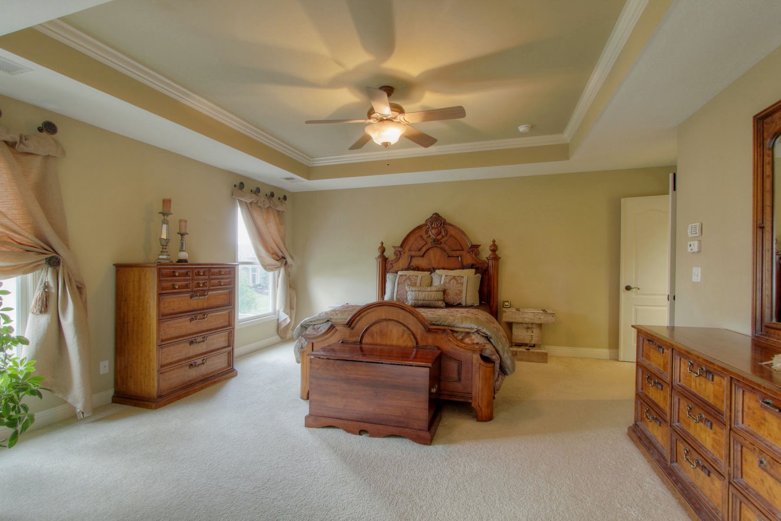
Master Bedroom.  
She was a quilter 
and had made this beautiful quilt.  
She also made the drapes and cornice.  
I found the matching pillows 
in the basement along with the comforter.  
Here is the thing about staging... 
Nothing is off limits!  
I tell people that I will be foraging 
through their things 
so if there is anything 
that they don't want me to see 
they had better get rid of it 
before I come back to stage!  
And let me tell you, 
I have seen some stuff 
that I won't talk about! 
Adorable pillows! 
The Master Bath 
really needed to be updated.  
They had a groovy walk in tub 
or fall in tub you might say.  
But again, it was not in their budget 
and you have to respect that 
and stage around it.
I actually placed the basket with towels there 
because I didn't want people to accidentally 
fall into the bath!
This cabinet was to the left 
when you entered the bathroom.  
I wanted to remove the desk 
that they had in the bedroom 
so I created a little vanity area.
I liked having 
the vintage piece in the room.  
The sewing room.  
Very pink!  
I really loved the curtains!  
They got to stay!  
The only two rooms that were painted 
were this room and the room next to it.  
The other bedroom that you will see next 
had a king sized bed in it 
with two twin mattresses.  
We took them apart 
to make two twin beds, 
one for each room. 
Better?  
The room was painted in Sherwin Williams 
Patience-one of my favorite neutral colors.  
This is the "blue" room with the king bed.  
There was a cute little doll house 
that the grandkids played with when they visited.  
Doesn't she have some nice antique pieces?  
She said that they were all handed down 
in the family for generations.  
Maybe they could adopt me?
I used the dollhouse as a headboard!  
And, the kids could still play with it!  
OK, so no big lesson today 
just a Before and After.  
I hope you all enjoyed it!  

Until Next Time,
Beaux R'eves

Sharing at:


Tuesday, February 18, 2014

Home Staging~Before And After~Week 4

Welcome back to my Home Staging
~Before And After Series!  
If you have missed the past three weeks 
you can find them all here.


So far we have covered Decluttering, 
Light and Bright Spaces, 
and Accessorizing.  
This week I would like to talk about something 
that I touched on briefly last week 
~ Photographs and the Internet~ 
85-90% 
(and I am being conservative here) 
of home searches begin on the Internet!  
The photos of your home 
ARE your First "First Impression" 
to the potential buyers.  
The second "First Impression" 
occurs when the potential buyers 
drive up to your home.  
(We will cover the outside next week.)  
And, lastly the third "First Impression" 
occurs upon walking into the home.  

In the Home Staging example 
that I am going to show you this week 
the homeowners were adamant 
about using their own photos for the MLS,
which shows up everywhere on the Internet.  
The Realtors tried to dissuade them 
but sometimes people just don't listen.  
They were in a huge hurry to list their home 
and didn't think that they needed a Stager.  
After a few weeks on the market 
and not ONE showing, the Realtors 
contacted me just to ask me 
what I thought of the pictures etc.  

Well, let's look:
 This is the first photo that you saw 
when you clicked on the listing.  
Would you want to view this home in person 
based on this photo?  
It's dark and blurry and it's hard to even 
tell what you are looking at.  
Is that a living room?  
I see stairs and some clutter on a table.  
Not too inviting...
The second pic on the listing.  
OK, living room, yes we guessed right.  
But that's the point!  
Don't make people GUESS what they are looking at!  
I know these Internet lookers!  
They have a short attention span 
and will click on over to the next house in a flash!  

OK, I am not judging here 
but if I am an Internet browser, so to speak, 
I am wondering 
WHAT THE WHAT 
is that thing that looks like some wood stacked 
up next to the couch with a head on it!? 
It has distracted me so much that now I am just over 
the whole house and nothing will change my mind.  
That is how people think!  
Let's FIX it! 
OK, After.  
What?  
No WOW!  
What a difference?  
Why is that?  
Because I am not a professional photographer! 
Let's see how it should REALLY look.
Ahhhhh!!! 
OOOOHHHHHHHH!!!  
Applause!   
NOW do you want to put this one FIRST 
on your list of houses to see?  
And the reverse angle!  
I could end this post right now because 
I think that I have made my point!  
But I love before and afters so we will keep going.  
I rearranged and angled the furniture 
to increase traffic flow 
and I got rid of the wooden side table.  
Profesh pic...  Nice!
Another angle.  
I really need to take more photography lessons!
 "Their" MLS photo.  
The angle of the picture is so weird 
that you have to really question 
what you are looking at.  
Too many personal photos, 
but of course you already know 
I will remove those.
My "After" .  
I angled the desk, 
removed the clutter 
and now you can see the pretty tile 
and striking wall color.  
Hey!  
How did he do that?  
You see the whole room and the pretty drapes too!  
The dining room "Before".  
I am usually the bearer of bad news in these situations.  
As much as I love toile the wallpaper has to go.  
It was just too distracting.  
We kept the drapes and painted a neutral color 
and now the floors stand out!  
I love the touches of green with the apples.  
Miss Beaux came to help me that day 
and I made her go to the market and buy green apples.  
I love the fact that she can drive!  

Professional angle.  
It's very dreamy, right?
Homeowners picture of the Great Room 
and Breakfast eating area.  
My eyes immediately go to the bar counter.  
I spent a lot of time looking 
at these pictures and 
wondering what that was.  
I see the dogfood bowls were left out 
and I am STILL 
wondering what that wooden thing is! 
My "After".  
I rearranged the furniture a bit 
and replaced the reclaimed wood breakfast bar 
with a table that I had at home.  
I put the tablecloth on the table 
to give the room some softness.  
I brought over a few of my extra chairs too.
MLS Photos show the entire space. 
Thank you Wide Angle Lens!

See what a difference Staging 
and Professional Photos makes?  
 Upstairs, little girls room, 
Before picture.  
Personal photos and lots of clutter on the shelf.  
The room itself is great.  
I love the Shabby touches 
and the wall color.  
I just cleaned it up a bit and lightened the bed-cover 
with my famous trick 
of all white with the bed-cover 
folded at the end of the bed. 
And an even better view!  
Another Girl's room.  
I love the theme but it is too cluttered for resale.
By just removing the sofa 
and repositioning the bed you gain so much space!
I really did think that this was an adorable house.
New MLS photo.  
The Guest Room.  
It looks dark and uninviting.  
I took out the extra furniture 
and used lighter pillows 
and that was it.
NICE!  
When I saw the Master Bedroom pics 
what jumped out at me was the chairs 
turned toward the fireplace.  
They were blocking the view.  
You are trying to sell the features 
of your home not furniture!
I literally wanted to reach 
through the computer screen 
and turn the chairs around!
Oh!  
I feel so much better now!  
I love those chairs, don't you?
So nice, 
how does he do it?  
The rest of the bedroom just for fun.
And the Master Bath.  
So, the lesson learned here?  
Your Internet Photos have to SELL your home!
All MLS photos courtesy of 
Midwest Virtual Tours

Until Next Time,
Beaux R'eves